


Retail / Cajees Cycles
THE RIDE STARTS
WITH THE BRAND.
GraphicsPro helps Cajees turn the energy of cycling into a clear retail experience—from campaign creative and social content to an e-commerce journey built to move.
MORE THAN A BIKE SHOP.
A BRAND IN MOTION.
Cajees has a deep product range, an established retail presence and a community that lives for the ride. The work is to make every touchpoint feel connected: bold enough to stop the scroll, clear enough to help people choose, and consistent enough to build recognition.
Brand evolution
FROM CYCLE CORNER
TO CAJEES.
We kept the energy of cycling and made the identity easier to recognise, repeat and take into every campaign.
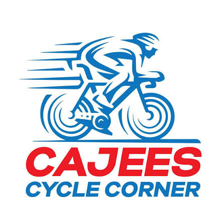

THE ORIGINAL RIDE.
The earlier identity put a detailed rider illustration and the full Cycle Corner name front and centre. It carried the history of the business, but had many elements to work with across digital and retail.
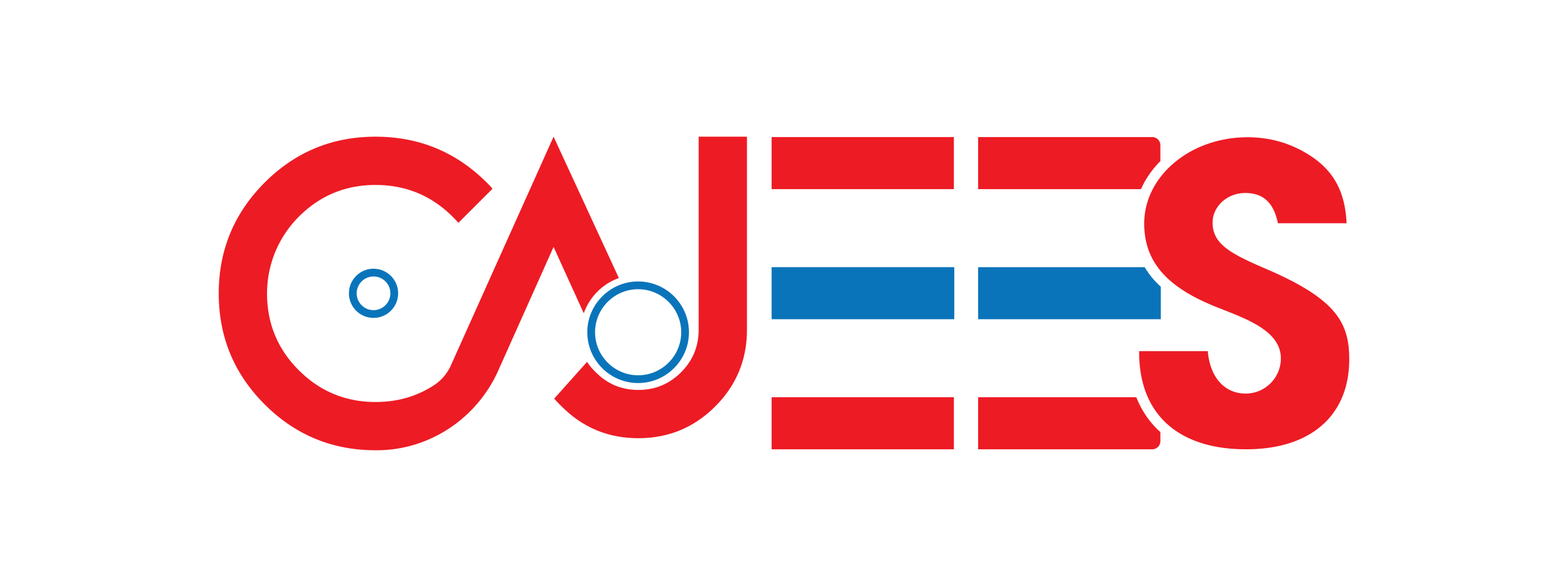
ONE CLEAR MARK.
The approved CAJEES wordmark keeps the red-and-blue character, with cycling cues built into the lettering. It gives the campaigns, store and product stories one recognisable signature.
See how that direction shows up in real Cajees social campaigns—not just on a brand board.
Define
Set a sharp visual direction that gives offers, products and promotions one unmistakable Cajees feel.
Direct
Turn product information into content that makes the next move—shop, enquire or visit—easy.
Repeat
Carry that direction across regular social work, seasonal campaigns and the e-commerce journey.
ONE BRAND.
MANY WAYS
TO RIDE IT.
Brand direction
A retail identity with enough discipline to hold a busy, constantly changing product world together.
Social media
Fast, product-led creative designed to earn attention and keep Cajees top of mind between purchases.
Campaign creative
Offers and featured products given a clear visual idea—so the message lands before the scroll continues.
E-commerce
An online store experience that helps people find the right category, product and next step with less friction.
Social media
BUILT FOR
THE FEED.
MADE TO
MOVE.

FIRST PEDAL STROKE — a confident, encouraging message for riders finding their start.
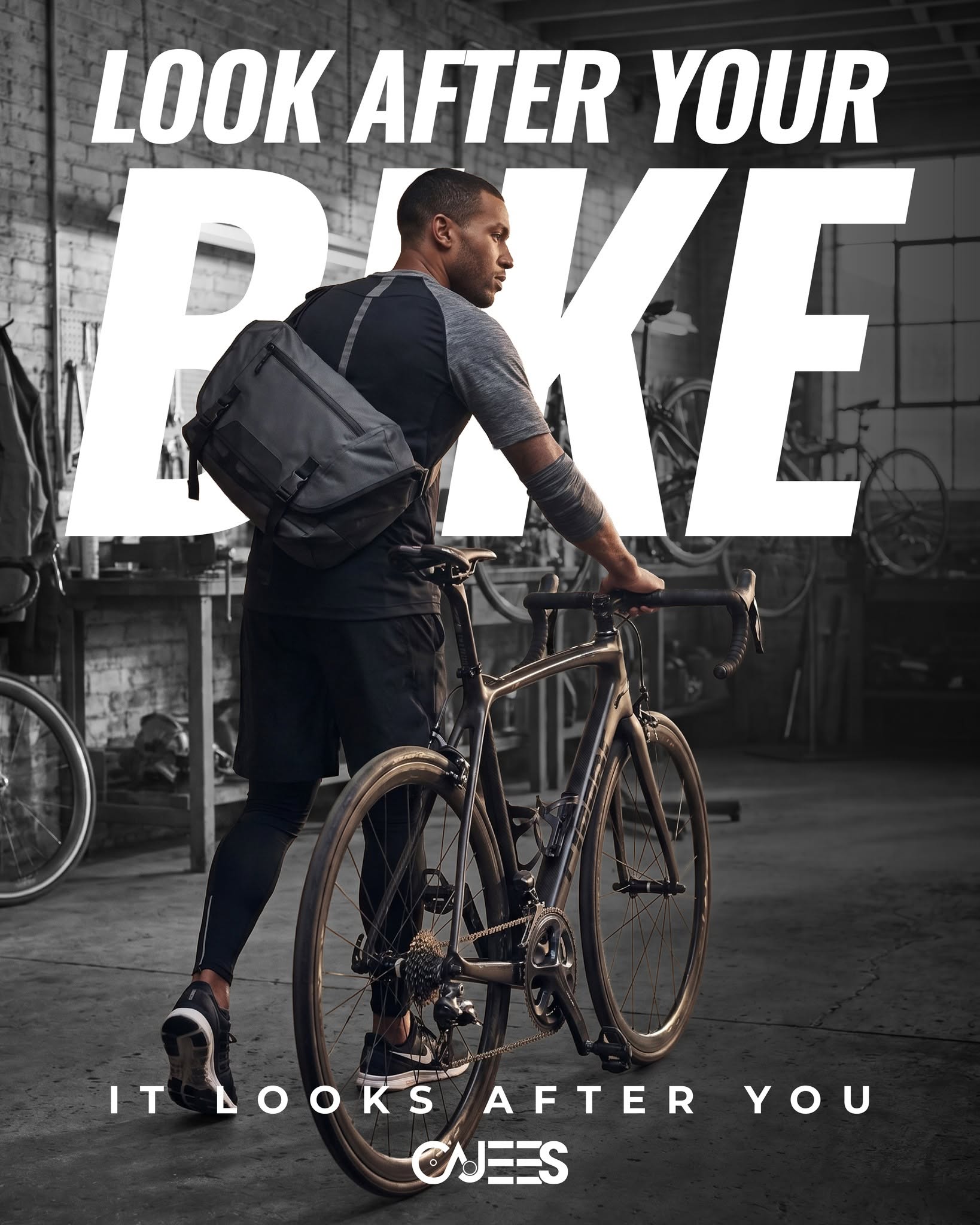
LOOK AFTER YOUR BIKE — practical rider advice made memorable through photography and type.
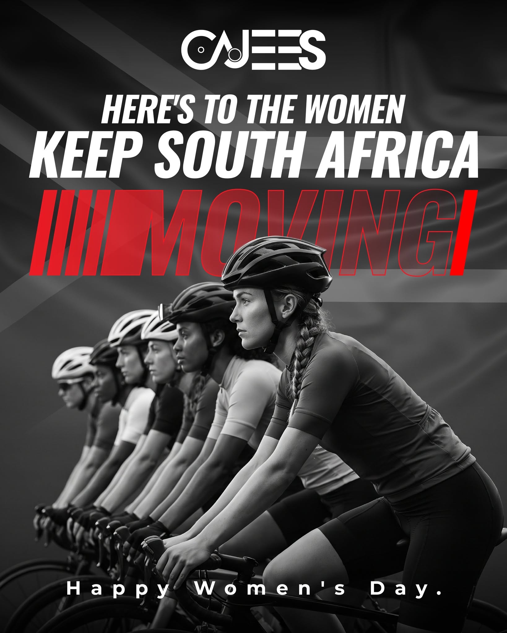
WOMEN’S DAY — celebrating the women who keep South Africa moving.
ONE BRAND. DIFFERENT REASONS TO RIDE.
These are approved Cajees social designs. Together they take the same recognisable identity from rider encouragement and practical bike care to a moment for the cycling community.
Reels / motion
THE BRAND.
IN MOTION.
The identity has to work beyond a still image. These short-form pieces bring rider energy, cycling detail and the Cajees signature into the feed.
Cycling detail made the hero.
The build-up before the ride.
The freedom of the ride, built for a vertical feed.
E-commerce
MAKE THE
NEXT CLICK
FEEL EASY.
The store is not separate from the brand. Every campaign, category and product page should help someone get closer to the right ride. GraphicsPro helps shape the creative system around that journey.