Brand identity
A more distinctive signature for the range.
Branding, label design and social media creative that make LV Nutrition easier to recognise — in the hand, on the shelf and in the feed.
LV Nutrition had the products and an established name. The opportunity was to make every point of contact feel like it belonged to the same brand.
GraphicsPro connected the identity, product labels and social creative through clearer hierarchy, recognisable colour and a more consistent visual language.
A more distinctive signature for the range.
Packaging that brings brand and product information together.
Creative that carries the product story beyond the pack.
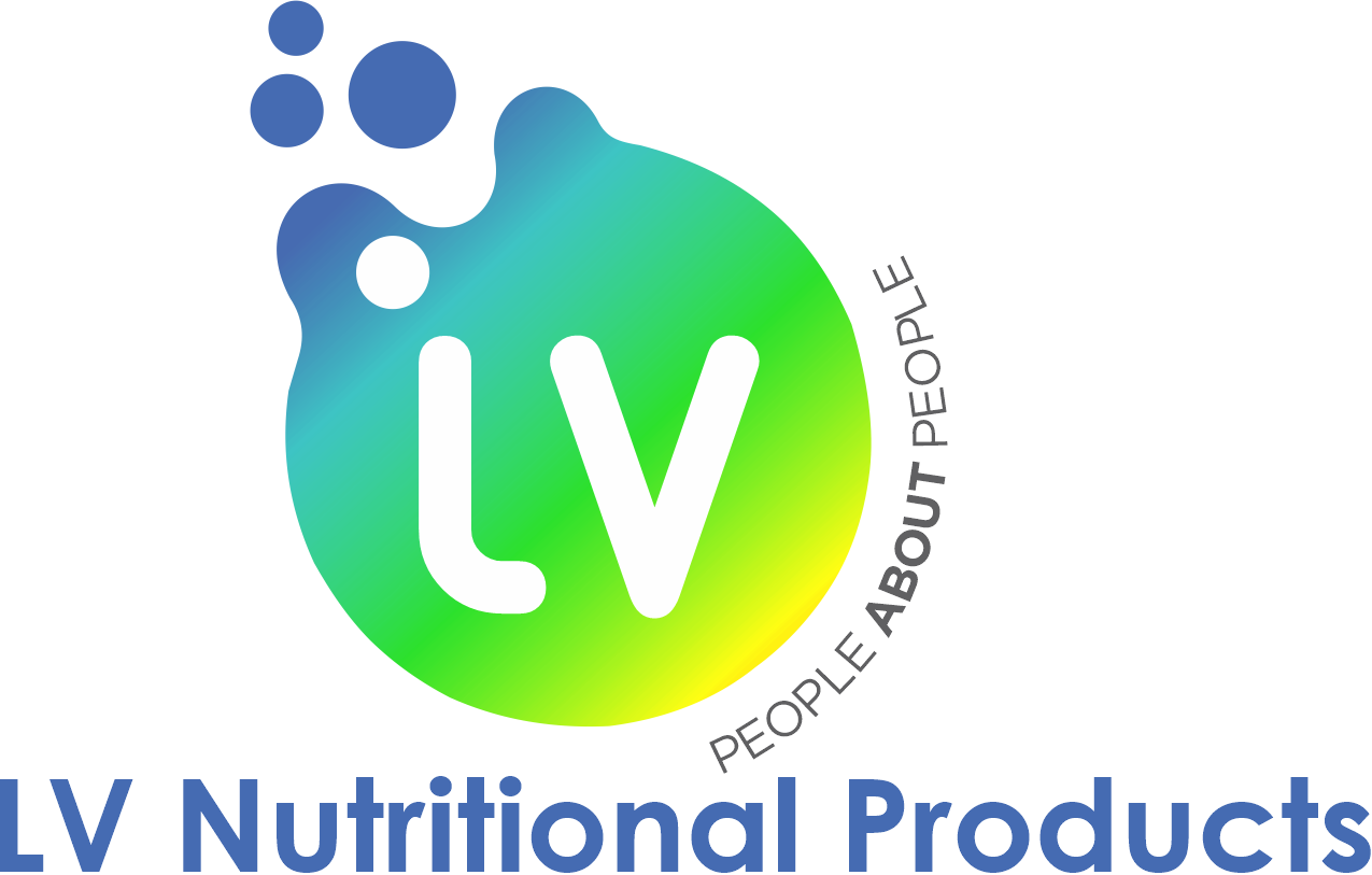
The earlier identity established the name. The redesign made it clearer and more recognisable across the range.
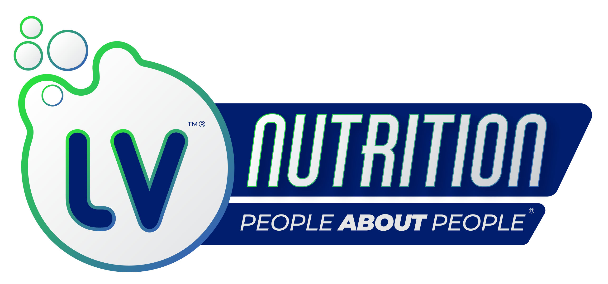
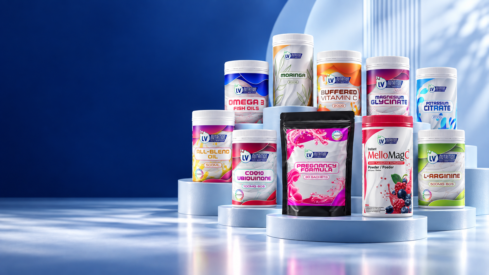
The current LV Nutrition identity gives the brand a stronger, more unified presence across its products and marketing.
The Pregnancy Formula pack tells the change story in one glance: from an older label with competing information and imagery to a more deliberate branded presentation. This is a design comparison, not a claim about the formula.

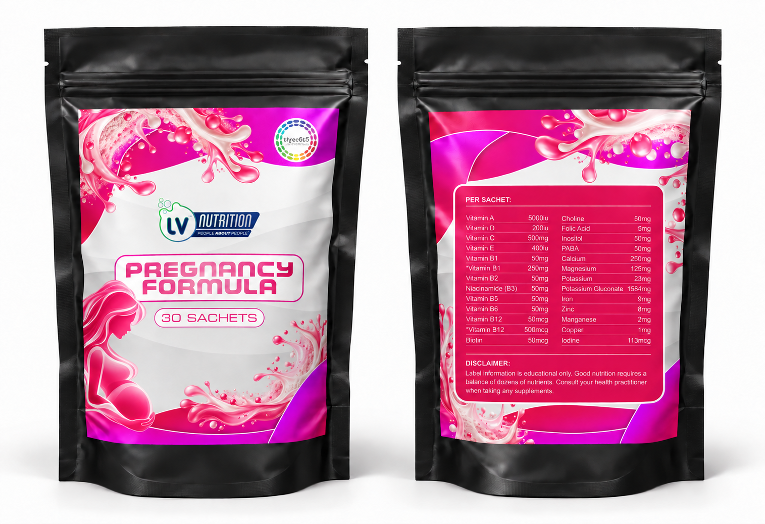
One identity should still leave room for individual products to have their own personality. The newer packaging keeps LV Nutrition recognisable while allowing product-level distinction.
One brand voice across the feed. These LV Nutrition designs show how product stories, everyday wellbeing and timely moments can each feel unmistakably part of the same family.
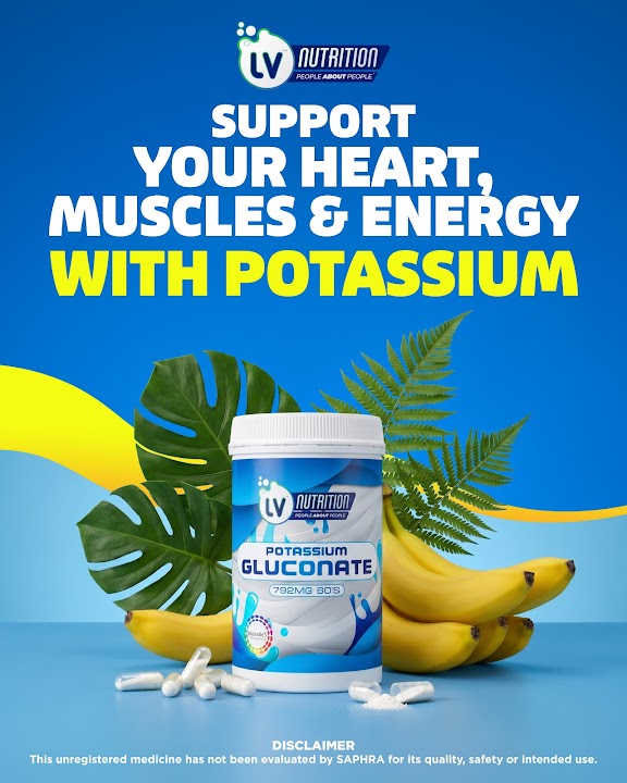
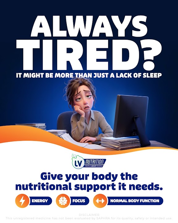
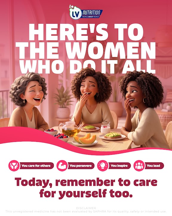
Short-form creative brings the LV Nutrition range into everyday moments. These reels pair clear product storytelling with the recognisable brand language carried across the campaign.
GraphicsPro designed LV Nutrition’s e-commerce website to carry the brand into a place customers can explore and shop. The visual system connects the product range, category pages and buying journey—so the experience feels unmistakably LV Nutrition from first click to checkout.
View the website →