

01 / Before
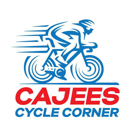
The earlier Cycle Corner identity, with its illustrated rider.

Connecting the energy of cycling across the Cajees identity, social campaigns, motion and online store.
See the work ↓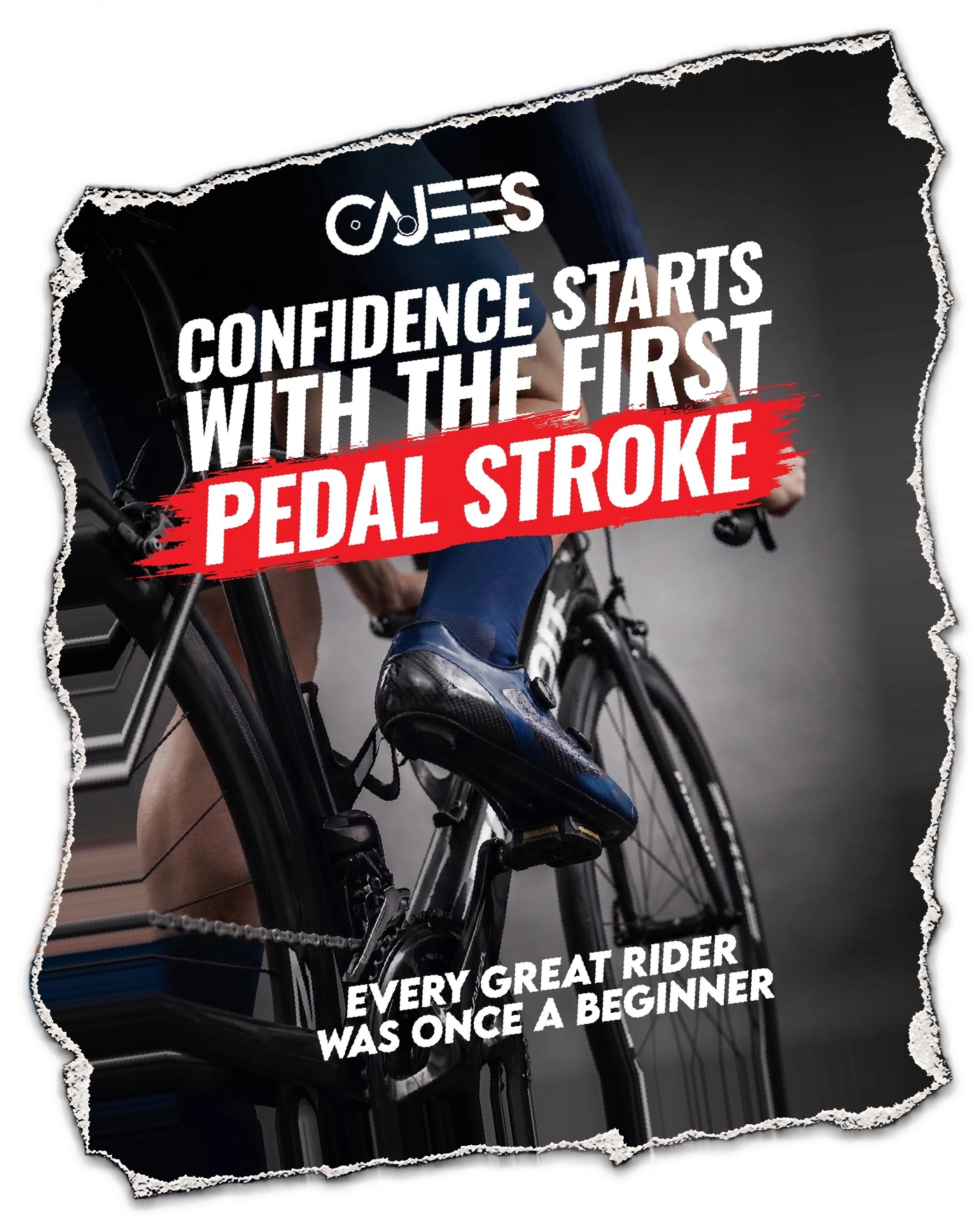
Cajees has an established retail presence and a community that lives for the ride. The task was to connect a busy product world through one recognisable visual direction.
We carried that direction across rider encouragement, practical advice, campaign moments and the e-commerce journey. Each piece has its own reason to catch attention while keeping the Cajees signature.
The approved wordmark keeps the red-and-blue character, with cycling cues built into the lettering. One clear signature to carry into campaigns and retail.
The earlier Cycle Corner identity, with its illustrated rider.
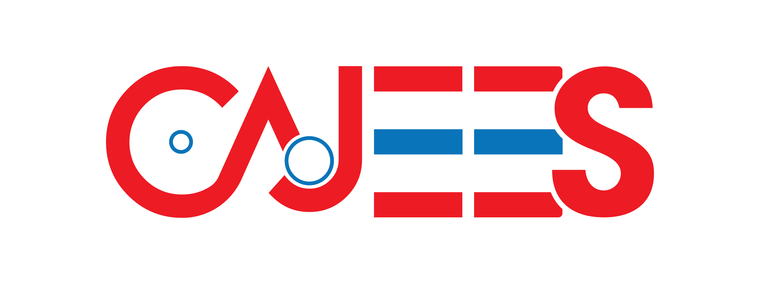
The approved Cajees wordmark gives the work one recognisable signature.
Encouragement for a first ride, practical bike care and a moment for the community. Different stories, one Cajees identity.


Short-form work carries the same identity into product stories and everyday moments.
The online store connects campaigns to browsing and product discovery. The brand direction helps that journey feel consistent from the feed to the store.
Explore the live website ↗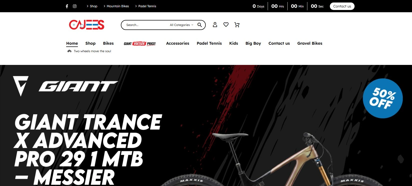
Let’s connect your identity, website, photography, video and marketing.
Let’s talk about your project